
Kitchen Visions
Residential Design · Greater Boston
Making the Work Easier to Explore
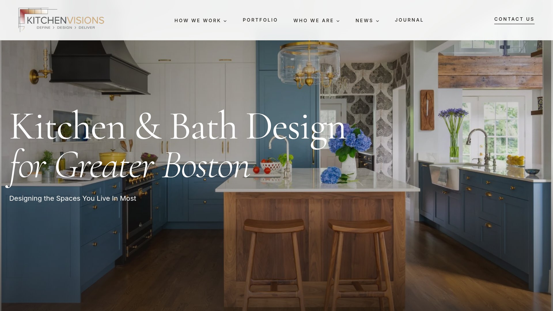
Kitchen Visions had a deep portfolio of residential design work, but the website needed a clearer way for prospective clients to explore it. The goal was to make the quality and range of the firm's work easier to understand without making visitors work through a complicated site structure.
The problem
The firm's work was the strongest proof of its capabilities, but the website did not make that portfolio easy enough to browse. Projects needed clearer organization, stronger visual presentation and more intuitive paths for homeowners exploring kitchens, bathrooms and other spaces.
What we changed
- 01
Reorganized project discovery
Created clearer ways to browse complete projects and explore work by space.
- 02
Made the portfolio the center of the experience
Used stronger project imagery and more direct paths into individual design stories.
- 03
Clarified the firm's approach
Restructured supporting content so visitors could understand how Kitchen Visions works, not just view finished rooms.
- 04
Improved the website's content structure
Created clearer topical and project relationships that support both search discovery and AI-assisted recommendations.
Explore the site
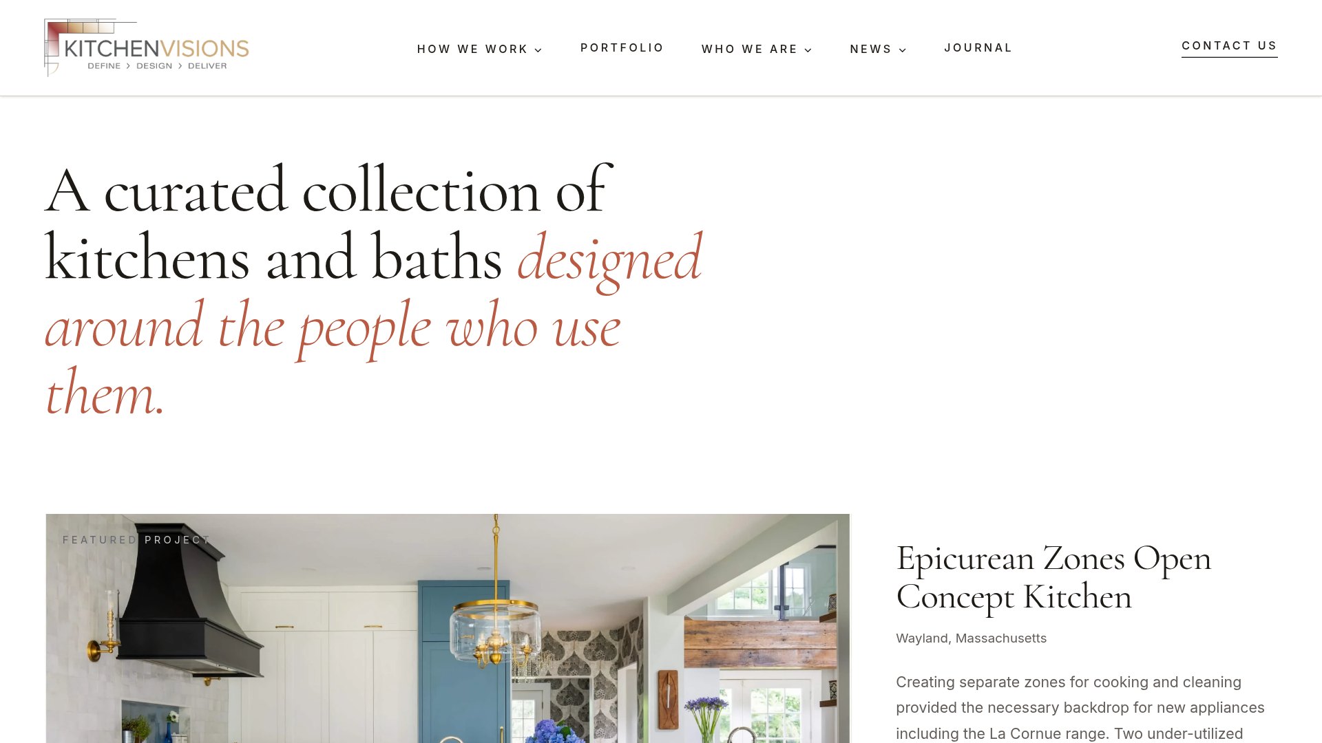
Selected screens from the current website.
The new experience
The resulting site puts the portfolio first while giving homeowners enough context to understand the firm's design process, expertise and range of work.
Related capabilities: Website Optimization · Generative Engine Optimization
Planning a website that needs to do more than look good?
Talk with DarbyMore Selected Work